Plot GLM vs IBLM Predictions with Different Corridors
Source:R/correction_corridor.R
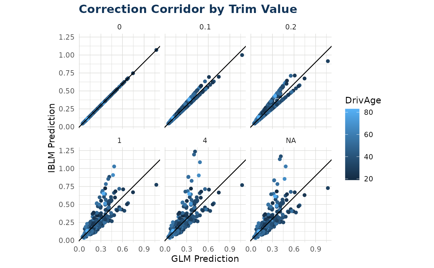
correction_corridor.RdCreates a faceted scatter plot comparing GLM predictions to ensemble predictions across different trim values, showing how the ensemble corrects the base GLM model.
Usage
correction_corridor(
  iblm_model,
  data,
  trim_vals = c(NA_real_, 4, 1, 0.2, 0.1, 0),
  sample_perc = 0.2,
  color = NA,
  ...
)
Arguments
- iblm_model
An IBLM model object of class "iblm".
- data
Data frame. If you have used `split_into_train_validate_test()` this will usually be the "test" portion of your data.
- trim_vals
Numeric vector of trim values to compare. The length of this vector will dictate the no. of facets shown in plot output
- sample_perc
Proportion of data to randomly sample for plotting (0 to 1). Default is 0.2 to improve performance with large datasets
- color
Optional. Name of a variable in `data` to color points by
- ...
Additional arguments passed to `geom_point()`
Value
A ggplot object showing GLM vs IBLM predictions faceted by trim value. The diagonal line (y = x) represents perfect agreement between models
Examples
df_list <- freMTPLmini |>
  dplyr::mutate(LogExposure = log(Exposure), .keep = "unused") |>
  split_into_train_validate_test(seed = 9000)

iblm_model <- train_iblm_xgb(
  df_list,
  response_var = "ClaimNb",
  offset_var = "LogExposure",
  family = "poisson"
)

correction_corridor(iblm_model = iblm_model, data = df_list$test, color = "DrivAge")